
We build brands, campaigns, and content that moves people. Every project you see here was designed with real goals in mind—like increasing sales, raising awareness, and helping small teams do big things.
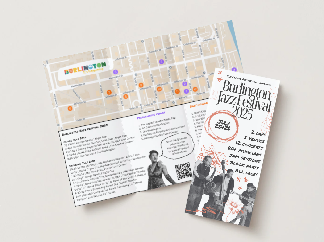
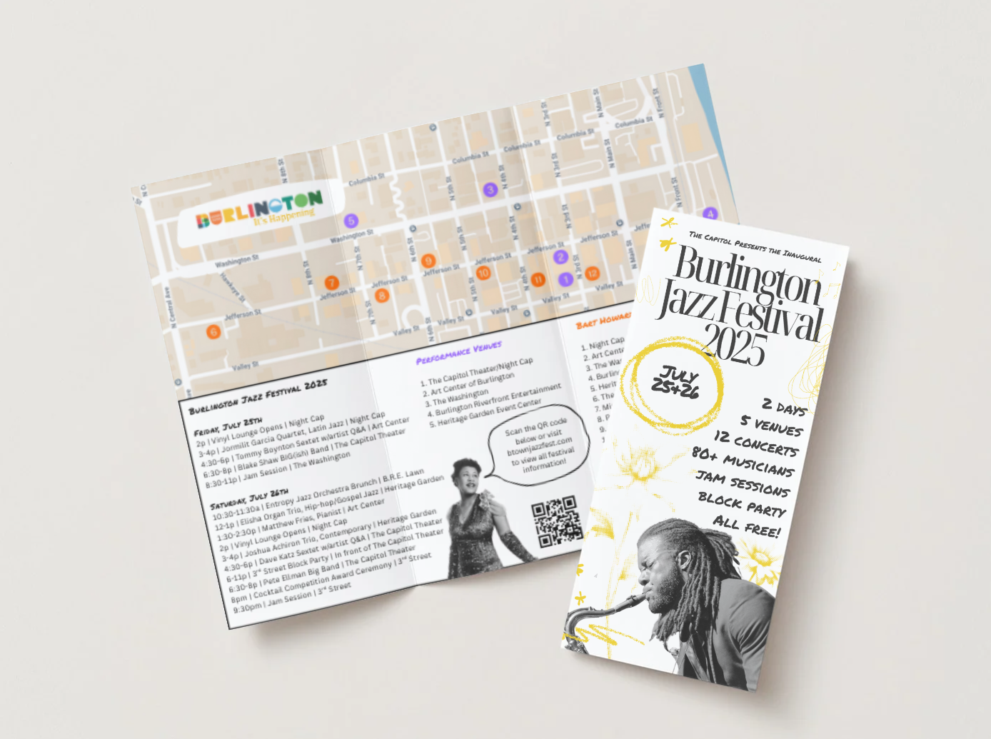
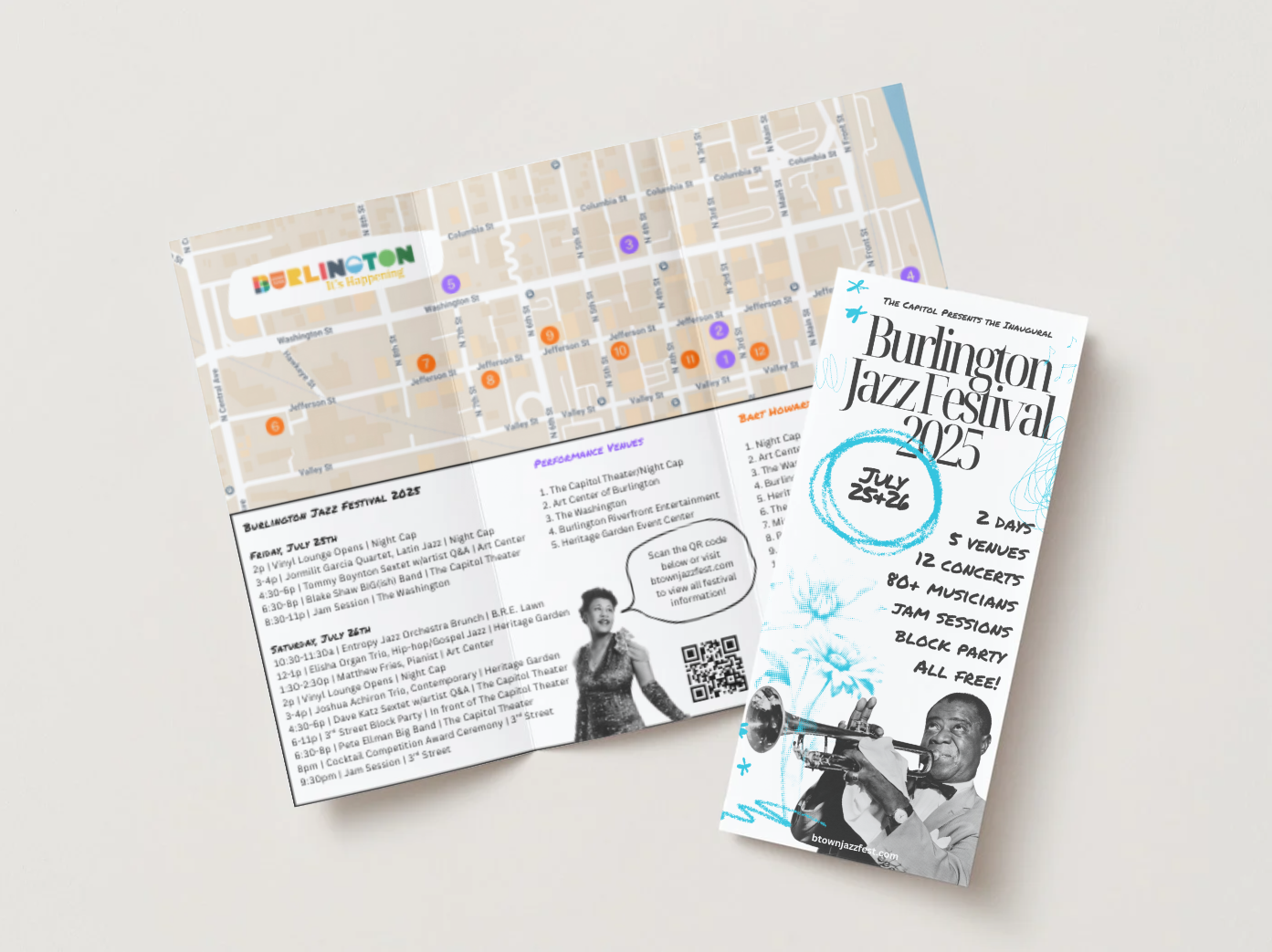
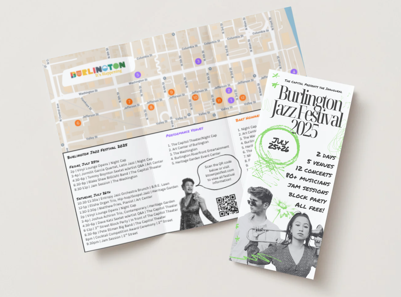

Burlington Jazz Festival
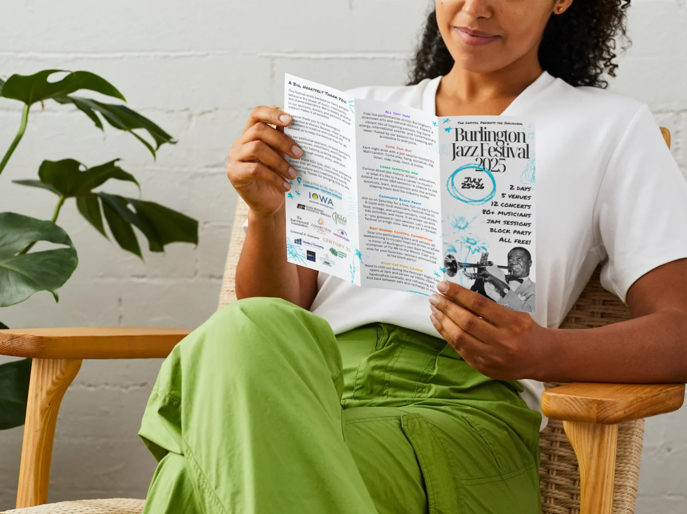
Problem: Burlington, Iowa’s inaugural jazz festival needed a brand identity that honored the city’s deep historical ties to jazz while avoiding cliché or retro tropes. The goal was to reflect the genre’s core values—improvisation, community, cultural influence, and creative energy—in a way that felt fresh, accessible, and distinctly local.
Solution: The visual identity blended archival materials like vintage newspaper clippings and historic event photography with vibrant, contemporary design elements. Bold primary colors grounded the brand in musical fundamentals, while a layered secondary and tertiary palette represented the genre’s evolution and the diversity of artists involved. By juxtaposing iconic imagery of jazz legends with candid shots of local community members, the brand conveyed a living, breathing celebration of jazz’s past and future. The visual language extended across digital assets, print collateral, event signage, and social media, with a system flexible enough to evolve year after year.
Results: The brand helped drive strong community engagement and sponsor support, drawing more than 1,000 attendees over the two-day free festival. The visual identity was praised by partners and press for capturing the spirit of jazz while celebrating Burlington’s unique cultural identity. Most importantly, it set the foundation for what is poised to become an annual regional tradition.
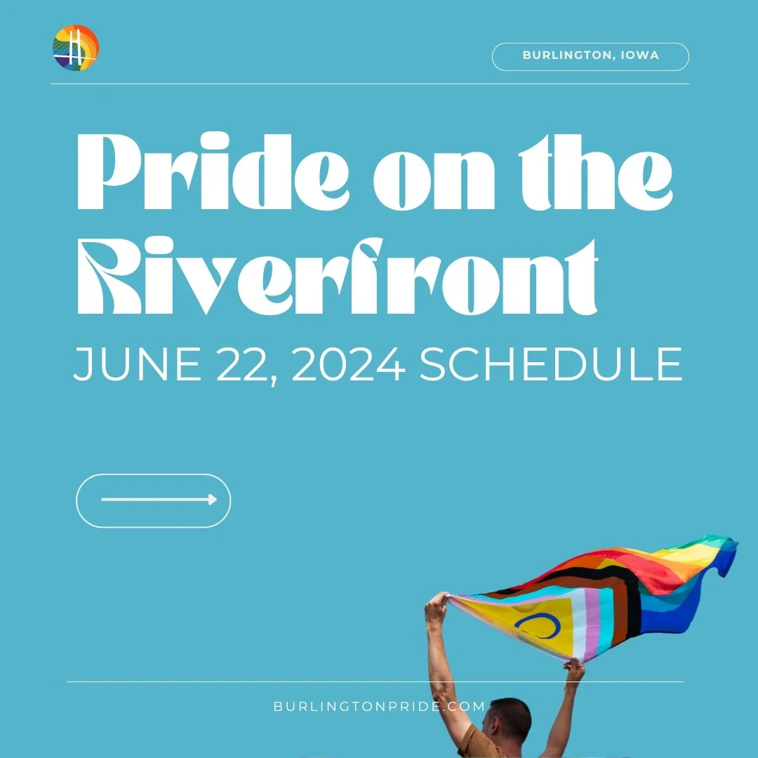
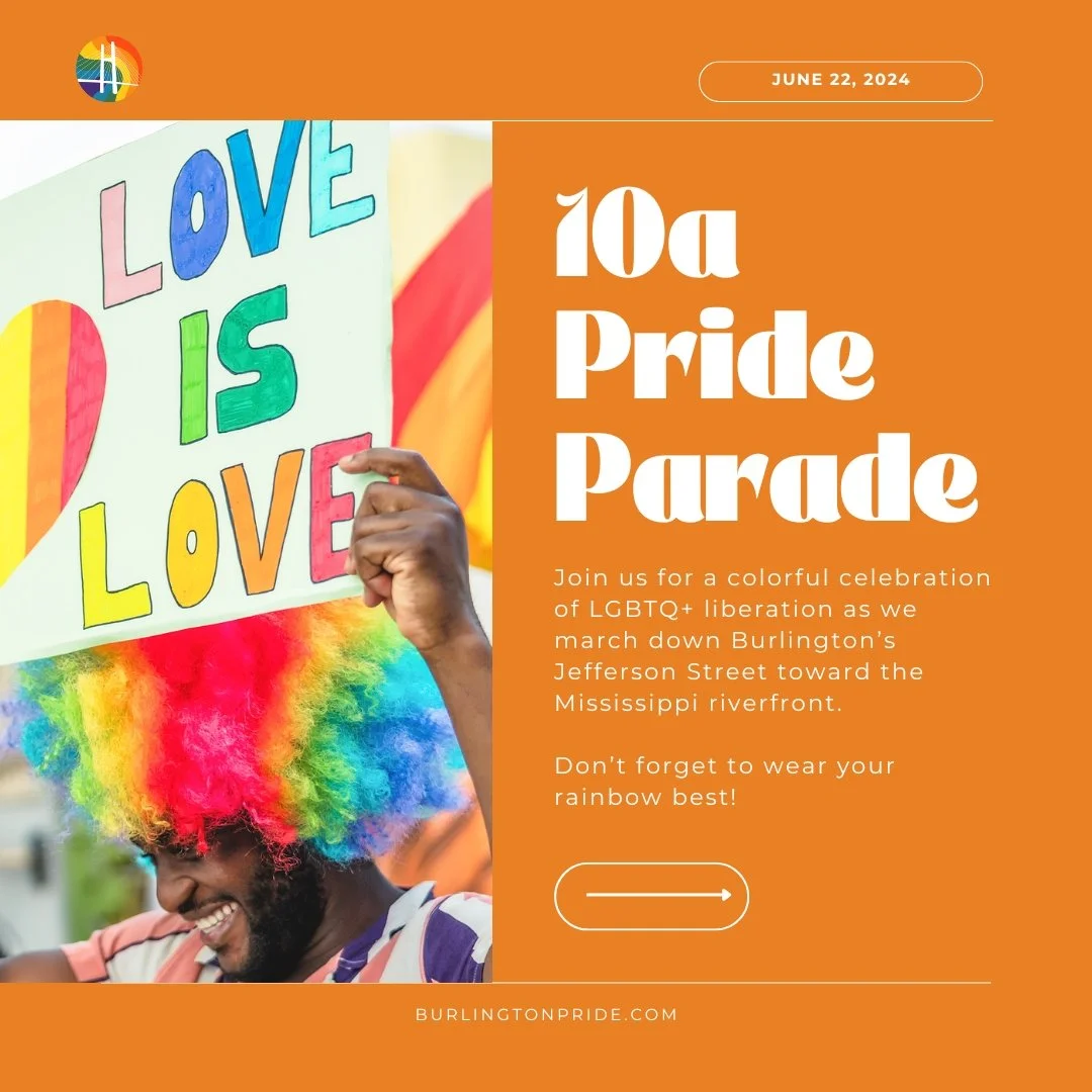
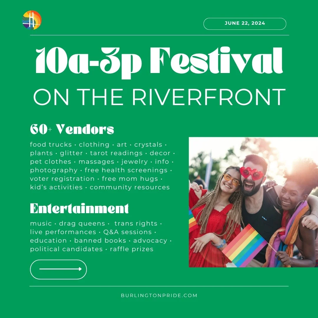
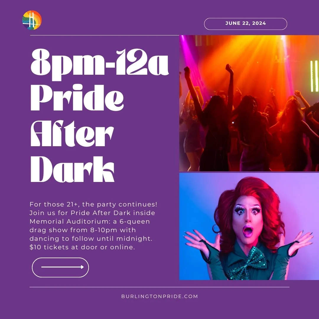

Pride on the Riverfront
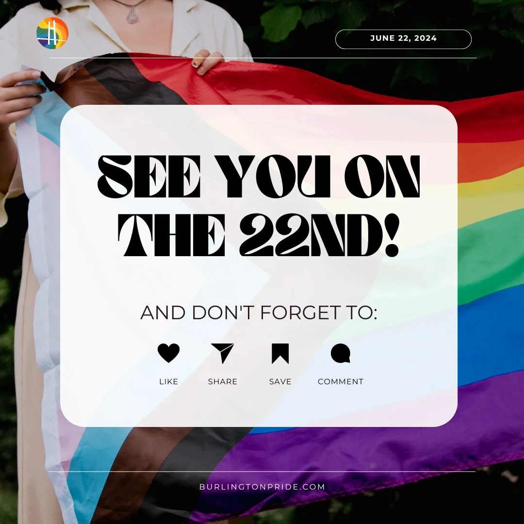
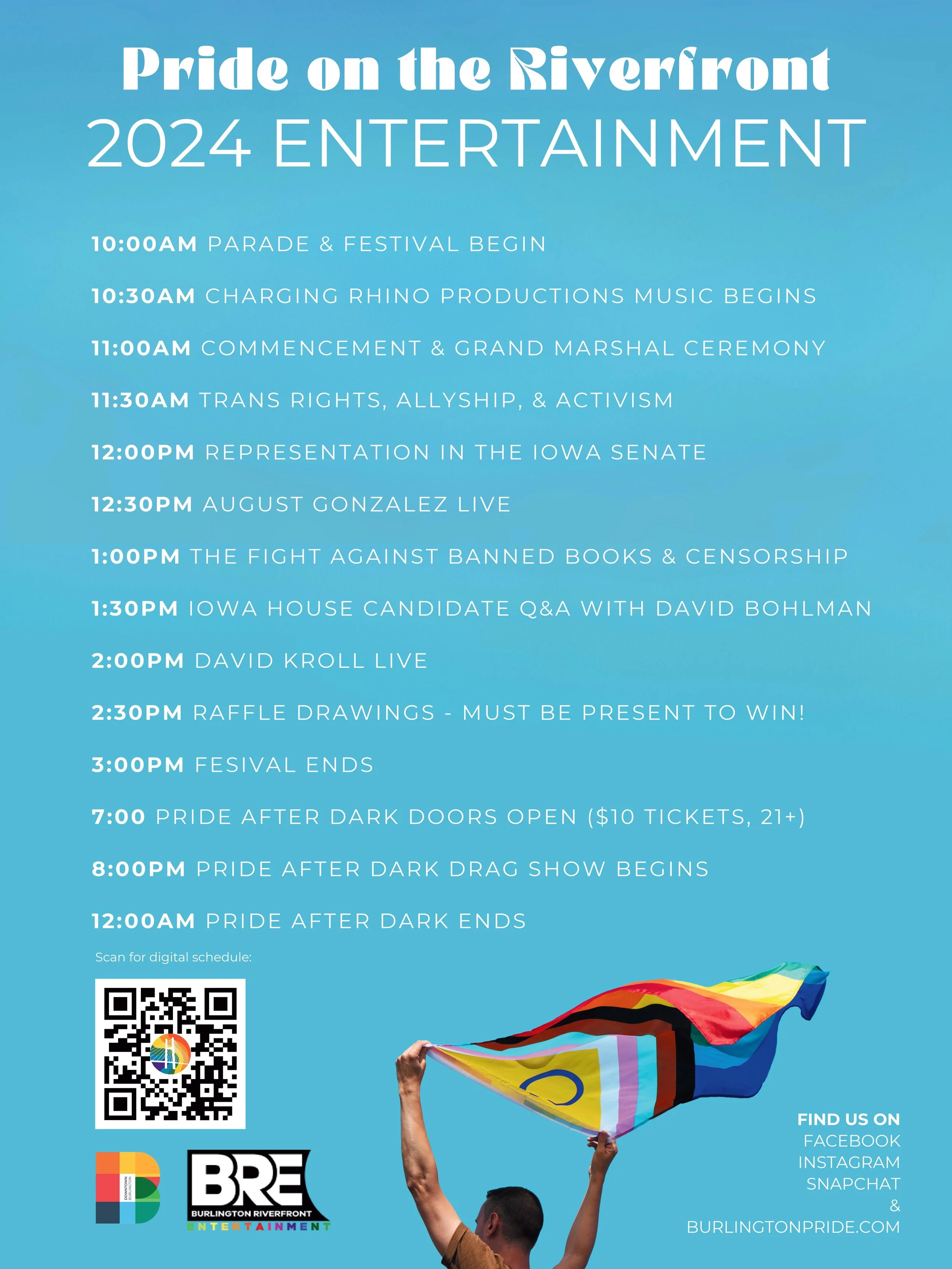
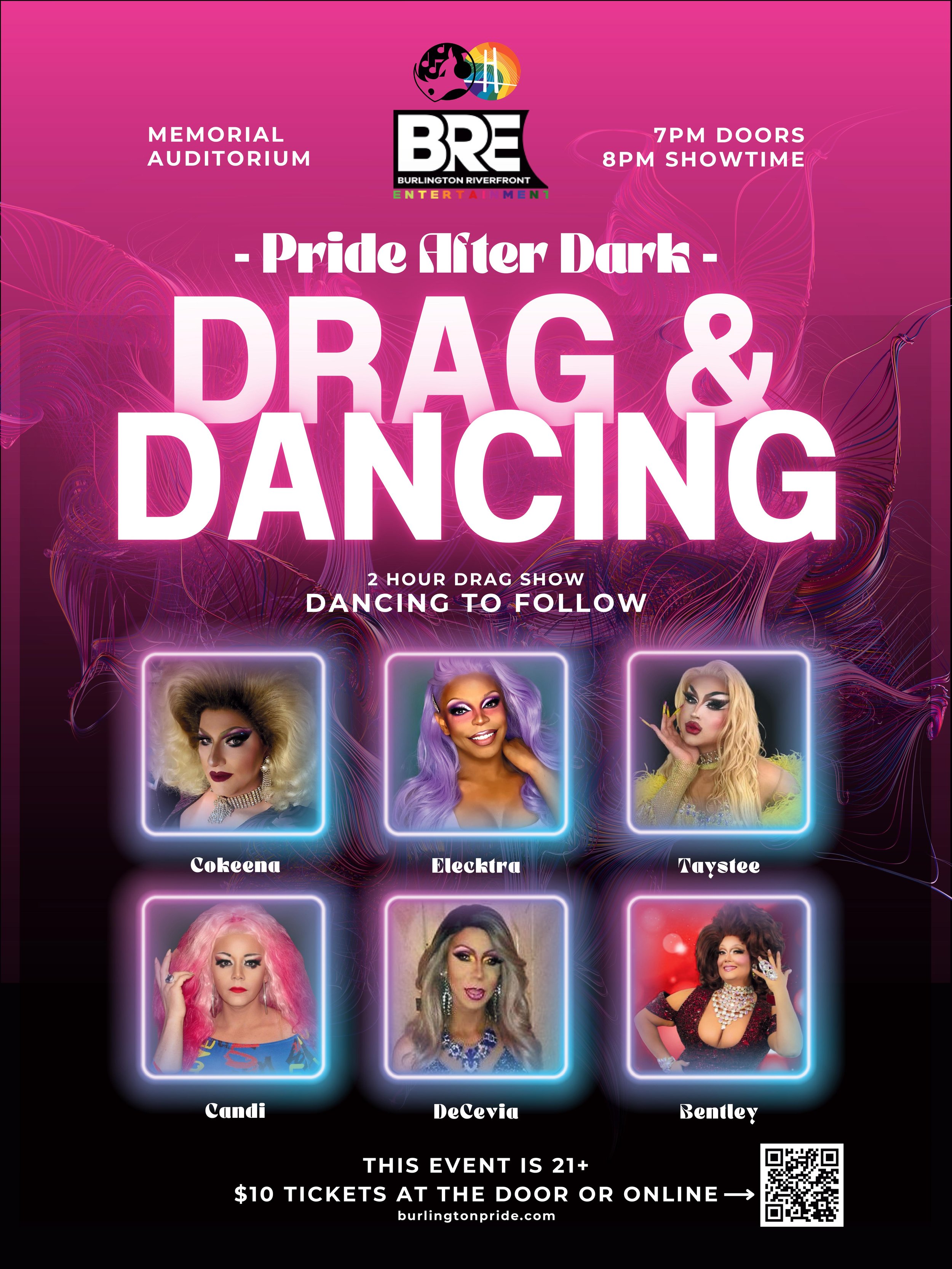
Problem: With just six weeks until event day, Burlington, Iowa’s first-ever Pride on the Riverfront Parade, Festival, and Pride After Dark drag show needed a full brand identity—from logo and website to marketing strategy and media outreach. The challenge was not only the tight timeline and limited budget, but also introducing a Pride event in a region with a largely conservative demographic. The brand needed to unite LGBTQ+ residents, allies, and broader community members to ensure visibility, support, and safety for the event.
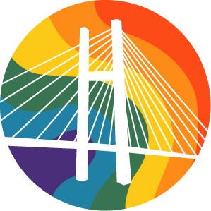
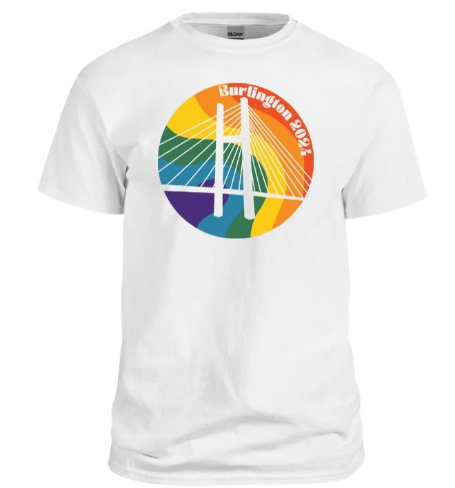
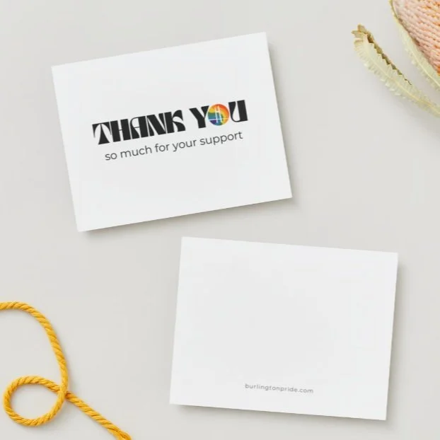
Solution: The visual identity centered around Burlington’s iconic Great River Bridge, reimagined spanning a rainbow-colored Mississippi River, following the river’s actual topography. Symbolizing both “water under the bridge” and the act of building new connections, the logo paired with a muted retro color palette and softened typefaces to feel inclusive, familiar, and reflective—not radical.
To build trust and humanize the event, the website focused on clear UX and values-driven storytelling. Social media emphasized authentic, community-centered photography and educational, inclusive messaging. A hyper-local grassroots campaign—including email marketing, radio outreach, press relations, and boots-on-the-ground distribution—focused on the theme of building bridges to generate word-of-mouth momentum across a 100-mile radius.
Results: The campaign generated over 61,000 impressions, 2,500 website visitors, and regional coverage across three newspapers, two radio segments, and two TV spots. The event exceeded expectations with 64 vendors, 34 parade entries, and 30 sponsors, surpassing the fundraising goal by 150%. More than 2,000 people attended the parade and festival, and the Pride After Dark drag show sold out with 300 tickets, achieving a 200% ROI. More importantly, the brand helped establish Pride on the Riverfront as a powerful symbol of progress and inclusion for southeast Iowa.

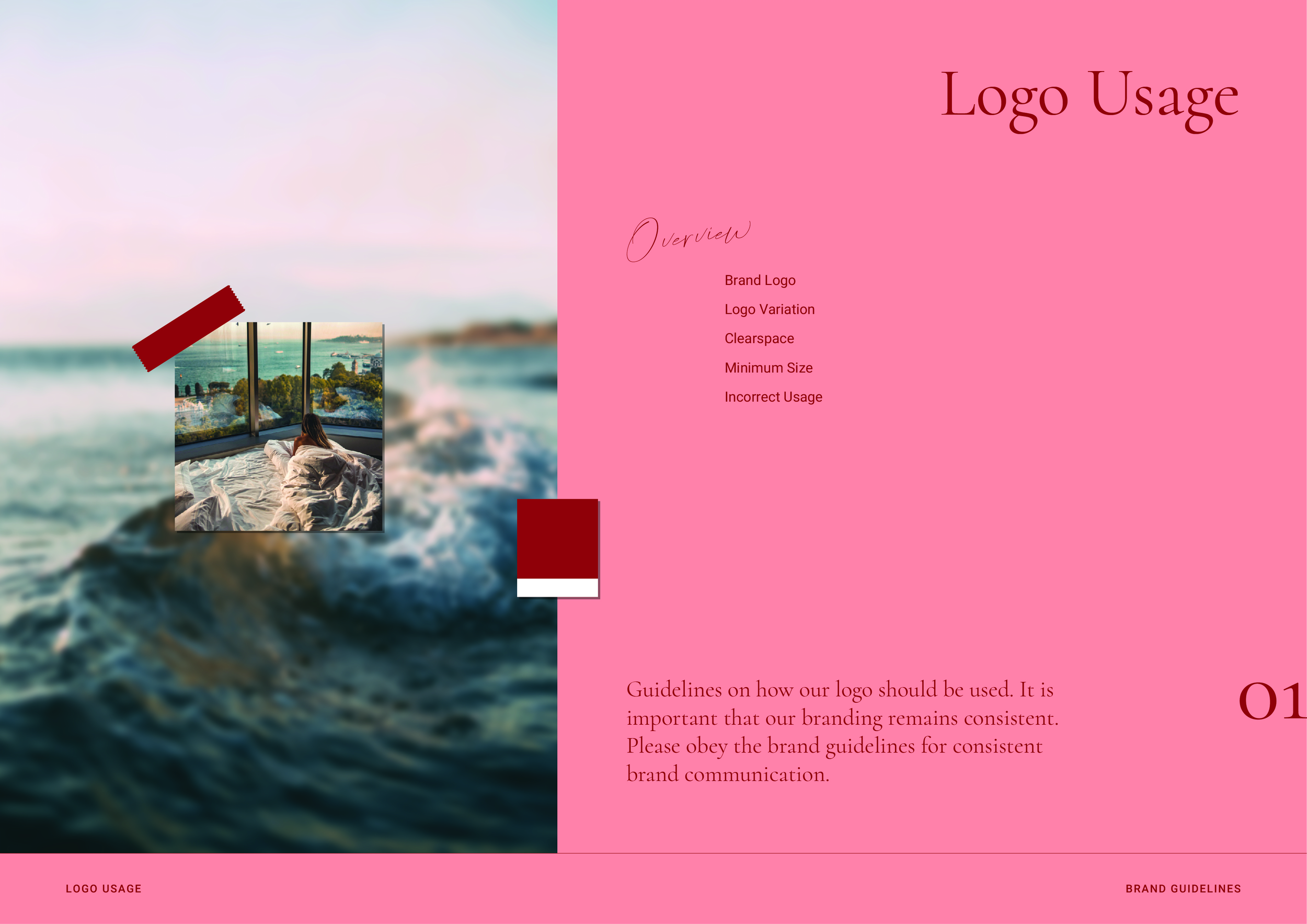
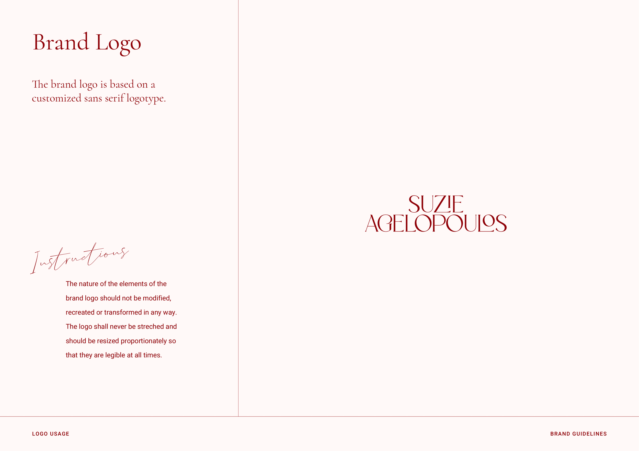
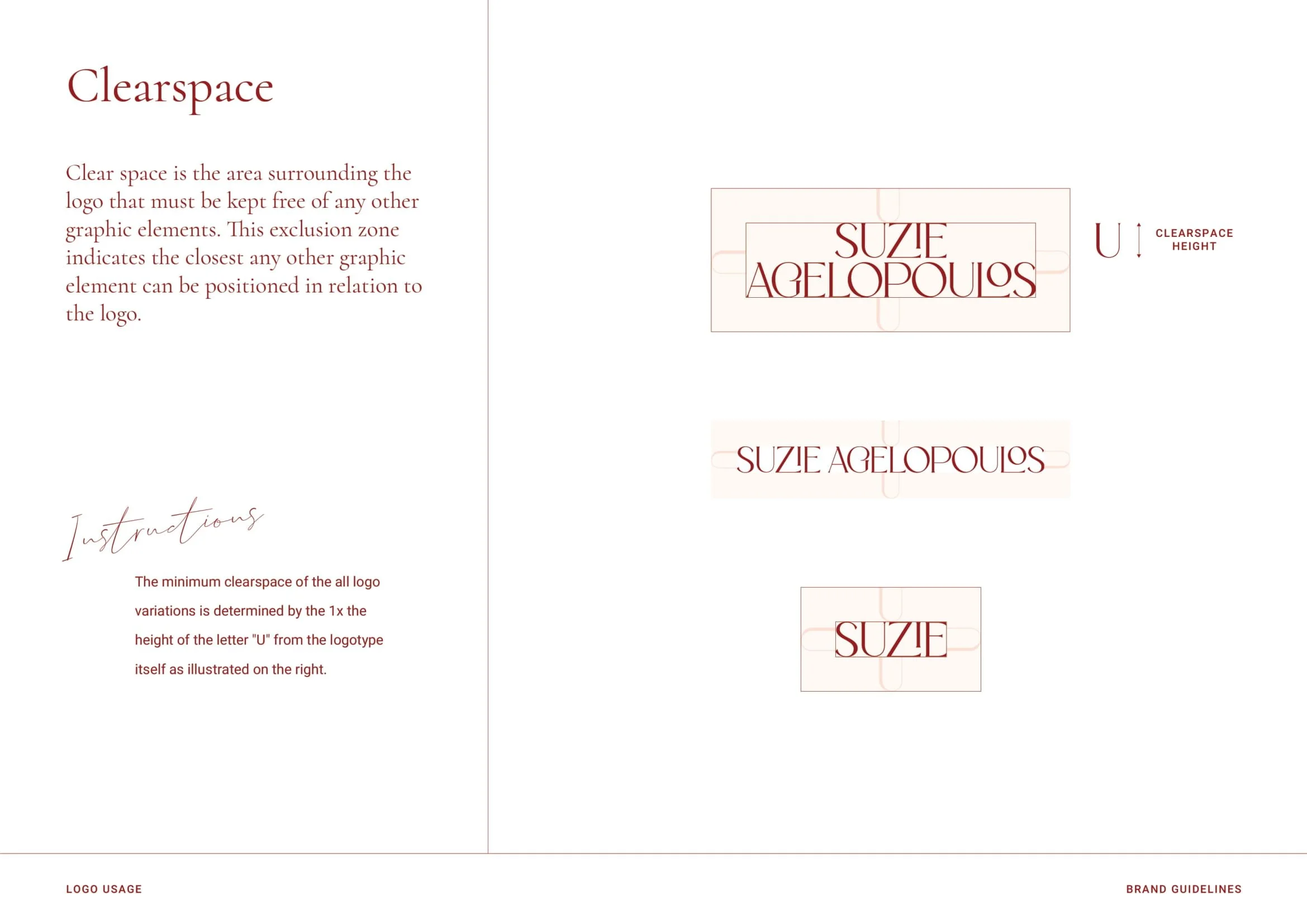
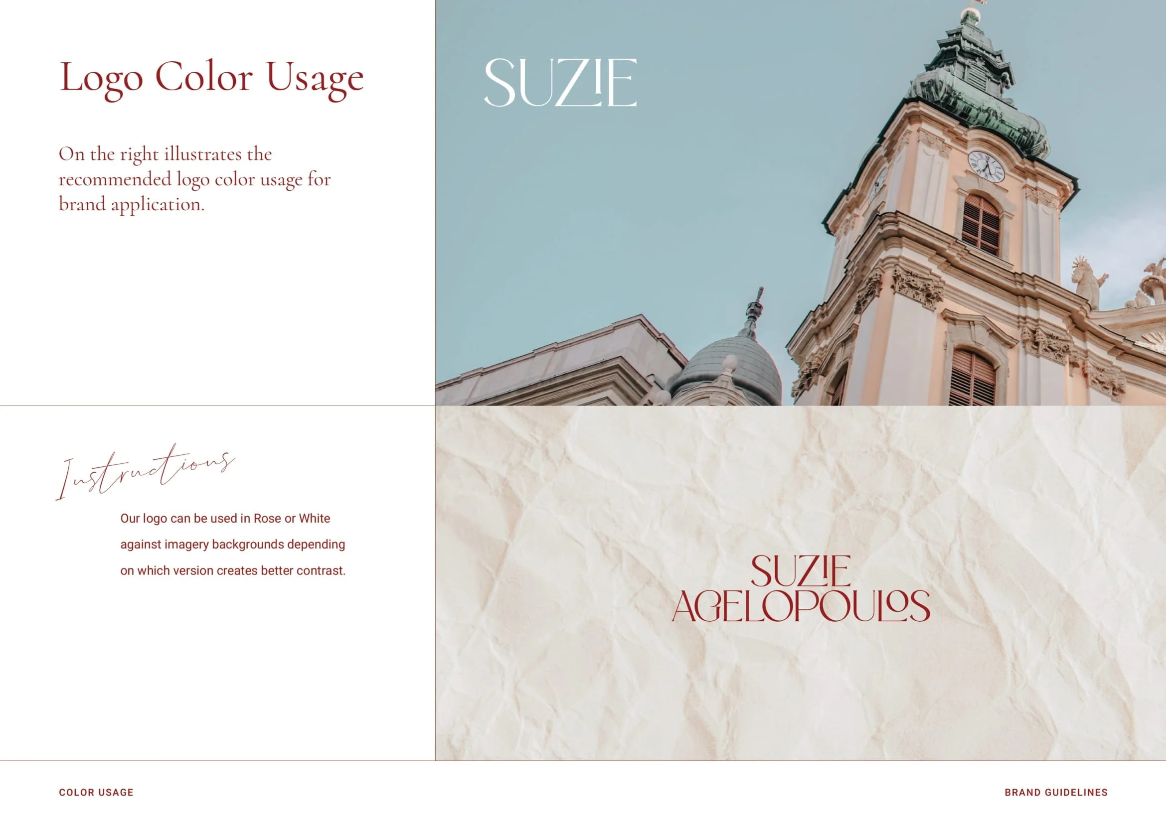
Suzie Agelopoulos
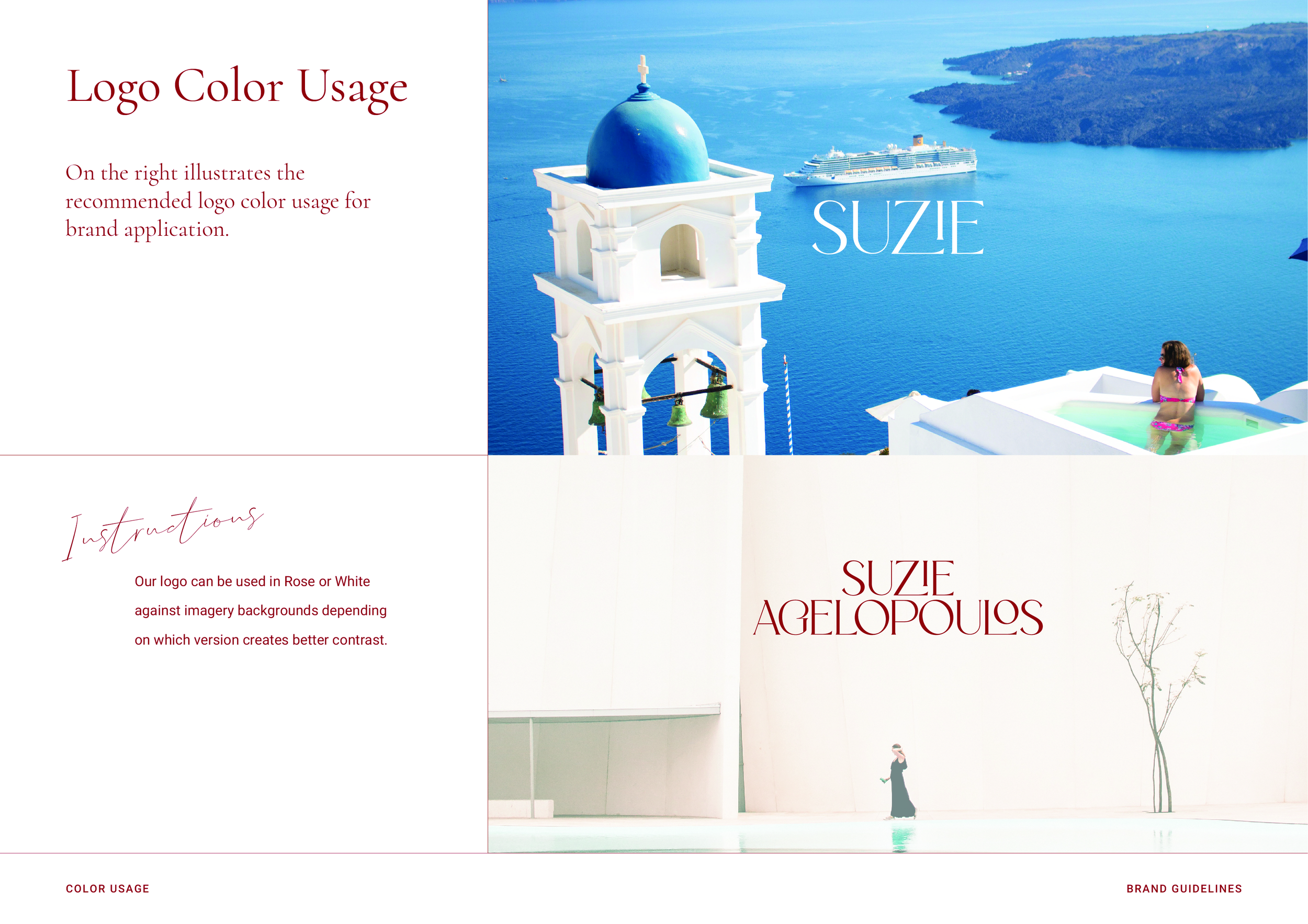
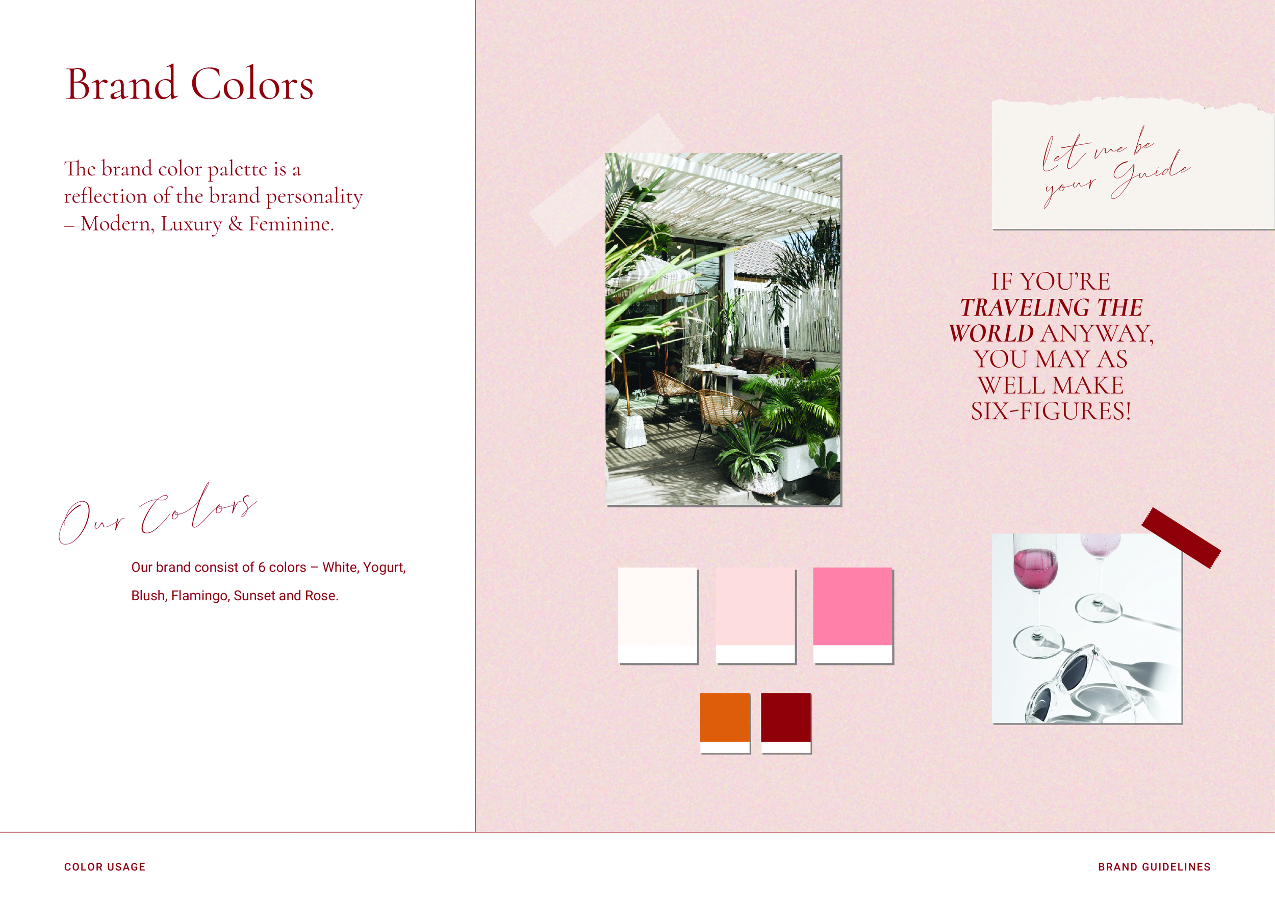
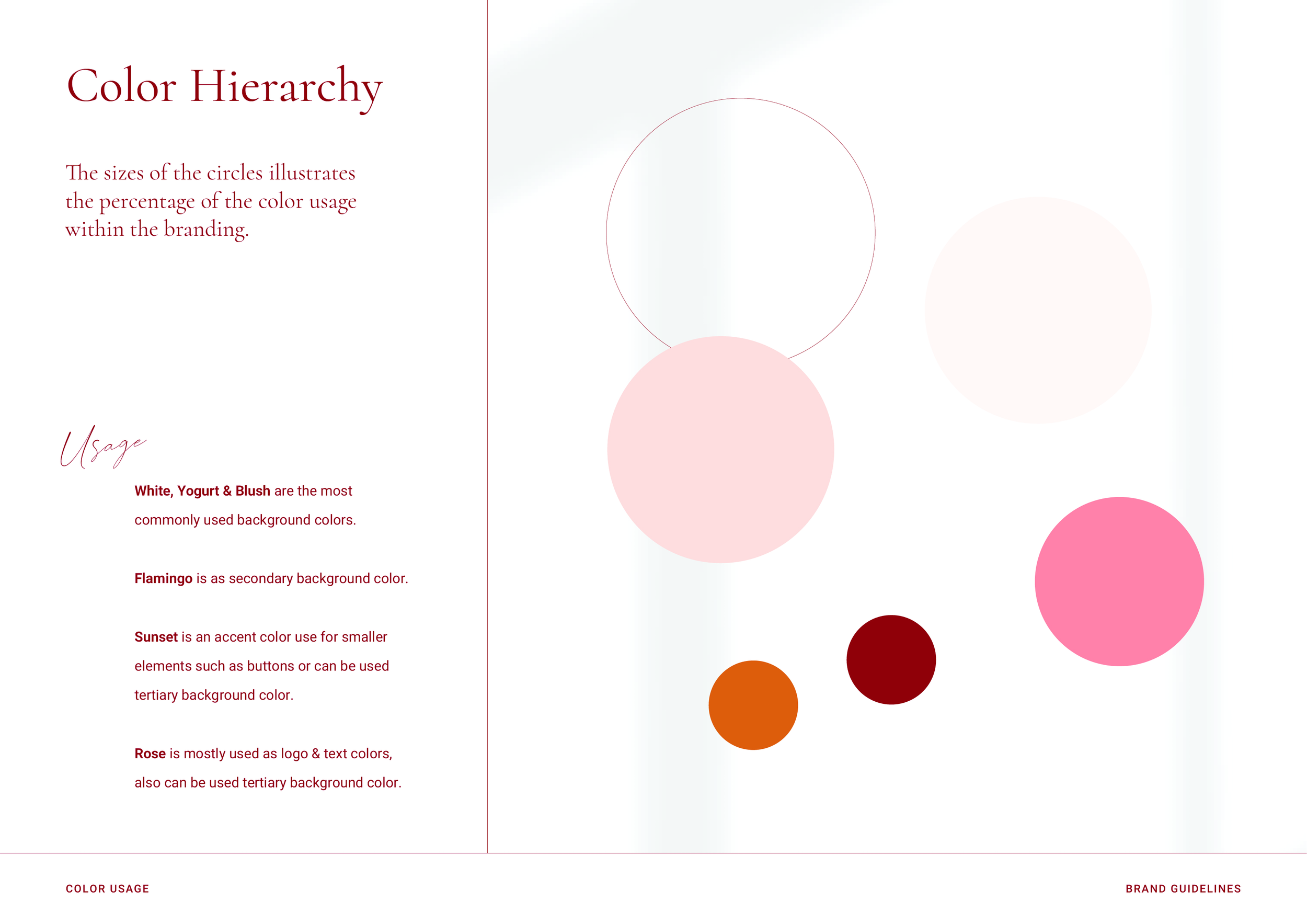
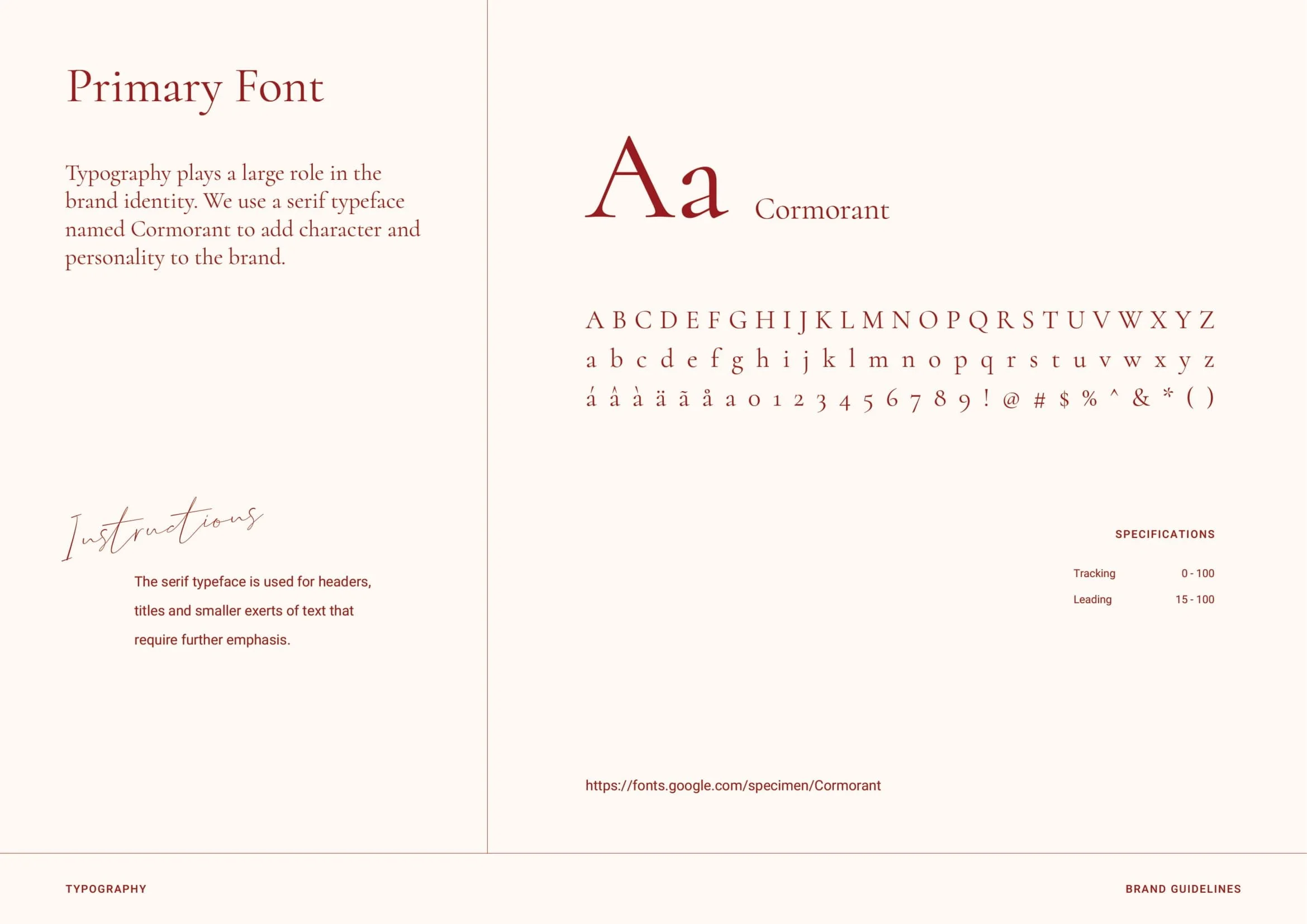
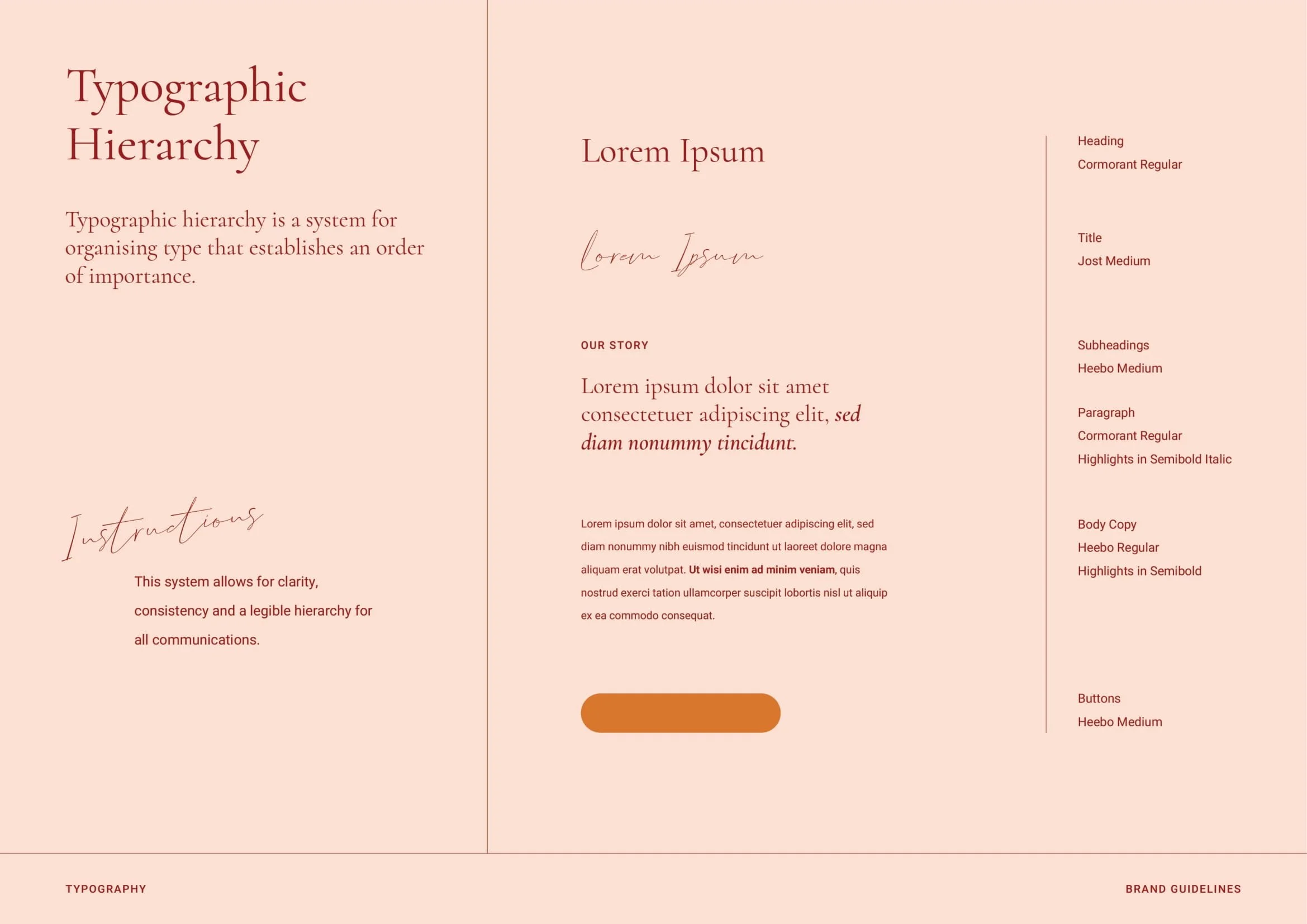
Problem: Suzie’s business had grown rapidly through word of mouth and personal charisma, but she’d never paused to define a brand identity. With no clear direction beyond wanting something that resonated with her audience (which, conveniently, looked a lot like her), she needed a brand that could match the scale of her ambition and the sophistication of her story.
Solution: We built a brand that channels the energy of everyone’s favorite globetrotting aunt—the effortlessly elegant, slightly mysterious woman who makes you wonder, “Wait, what do you actually do?”
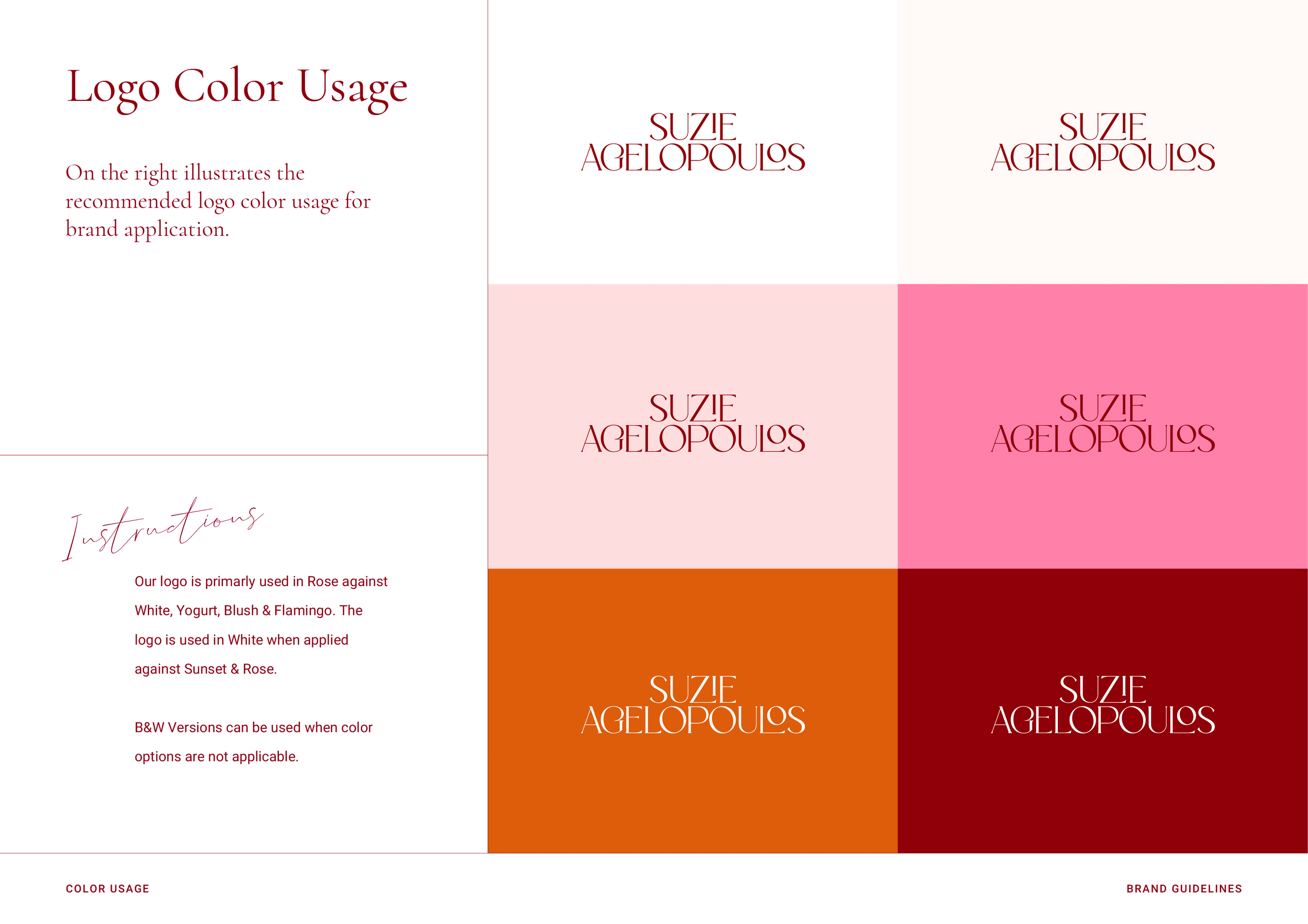
Suzie is the brand, so we anchored the identity in her personal narrative, with subtle nods to her Greek heritage woven into the visual language.
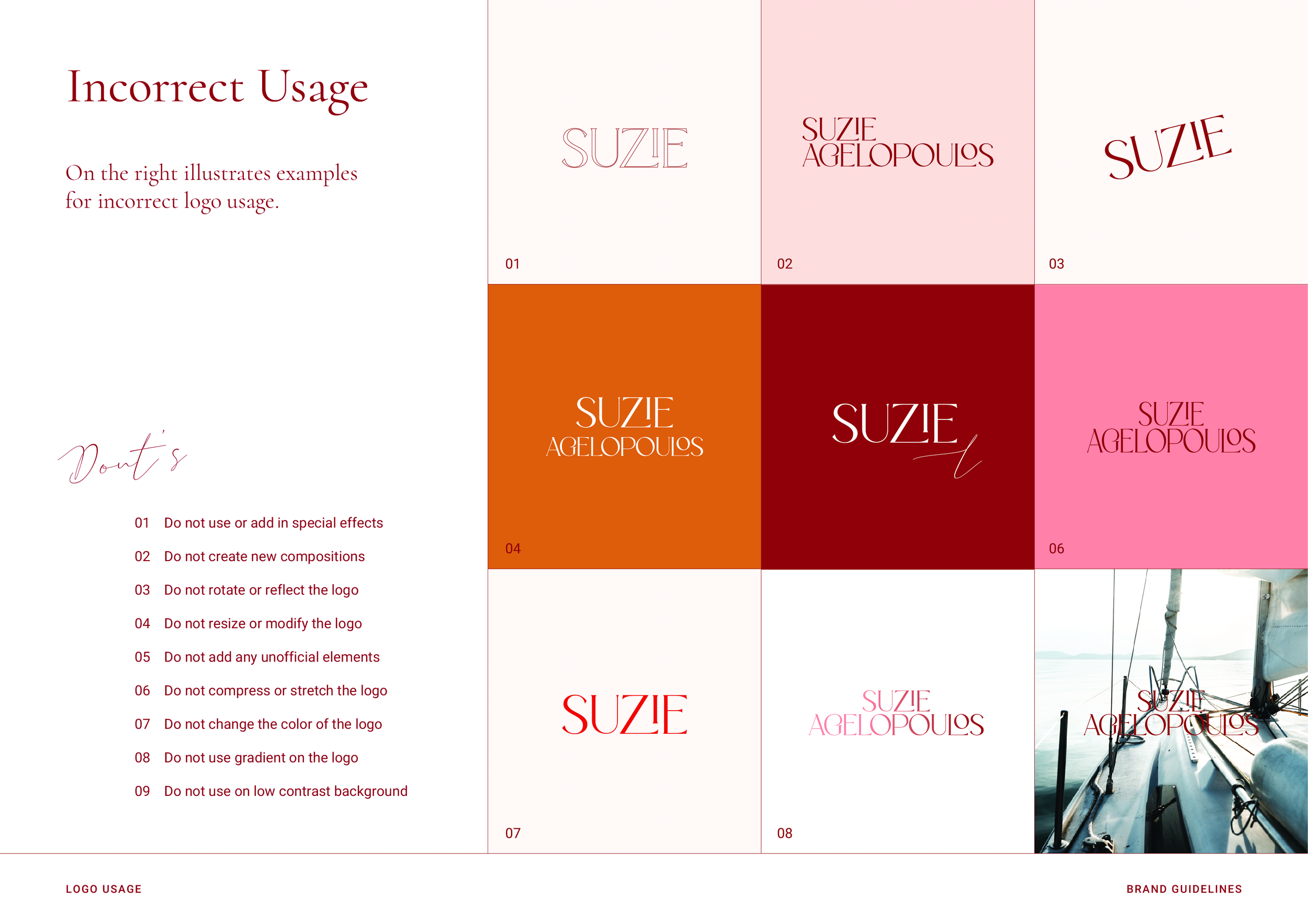
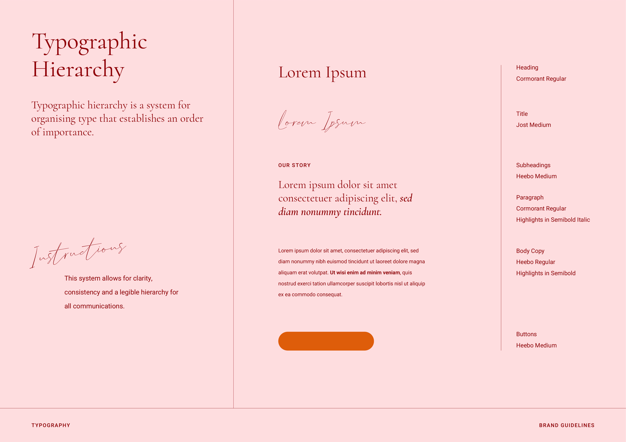
A soft, feminine aesthetic met bold, modern flourishes—pairing delicate curves with confident color blocking and striking typography. The brand speaks directly to the entrepreneurial, child-free, passport-stamped millennial woman who wants to build wealth on her own terms. From brand voice to visual identity, the result was a refined but playful presence that felt both aspirational and deeply personal.
Results: Following the brand launch, Suzie saw a measurable uptick in engagement, with increased traffic to her digital platforms, higher-quality client inquiries, and a noticeable boost in product and service sales. The brand gave her the clarity, confidence, and polish she needed to scale her business with intention.








Elevate Her Marketing
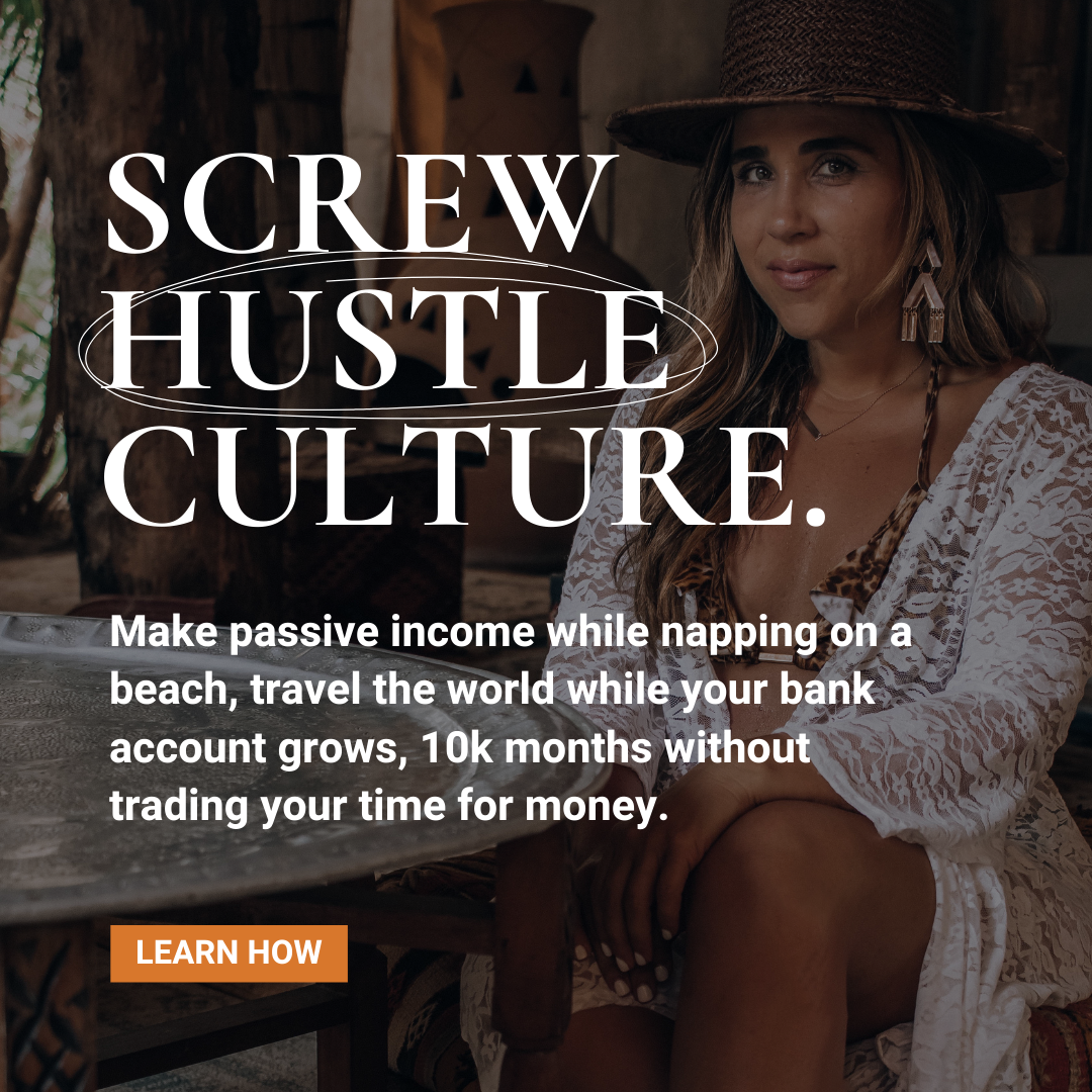
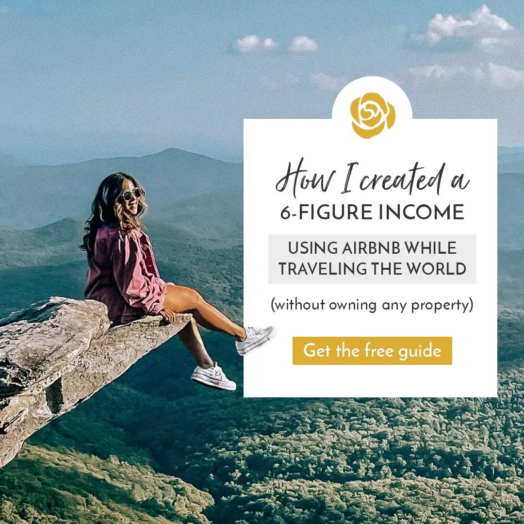
Problem: The online course and digital product space is saturated, with countless brands competing for limited audience attention. To generate real results in this landscape, businesses need ad creative that not only stands out visually but also speaks directly to their ideal customers—driving clicks, capturing leads, and ultimately increasing sales.
Solution: As part of the Elevate Her Marketing team, we developed strategic creative campaigns for a diverse roster of 12 clients across industries. Under our creative direction, the team crafted ad concepts that blended brand-aligned visuals with compelling, conversion-optimized copy. Each campaign was tailored to reflect the client’s unique voice, audience, and business goals.
We worked closely across design, copy, and media buying to ensure every asset—from static graphics to short-form videos—was crafted to stop the scroll, tell a clear story, and encourage action. Our creative process was rooted in deep audience insight, trend awareness, and a focus on performance, ensuring the final deliverables were both beautiful and effective.
Results: Across the client portfolio, campaigns achieved an average 1% click-through rate and a positive return on ad spend (ROAS), a strong benchmark for performance in the competitive online course market. The creative systems built during this time helped position Elevate Her as a trusted partner for scaling personal brands and digital educators.
A Few Things We’ve Written
-
-
Sound Like You?
I don’t make enough money to require legal protection.
There’s nothing I can do TODAY to get my business legally protected.
I’ll hire a lawyer to get my business legally sound once I have enough clients.
❌Oops...I didn’t realize that having ANY client puts me at legal risk, no matter how much money I’m making. Now I’m losing hard-earned growth to this avoidable legal snafu.
Truth is this: you don’t always need a lawyer on retainer
All you need is someone to tell you exactly what to do so you can get your biz legally protected in a matter of days, not years.
💻Keep Your Business Progress Runnin’ Here: [link]
-
As an industry, we have barely scratched the surface when it comes to applying artificial intelligence. At the exponential rate of technology innovation, how long will it take for AI-powered features to be as integral to the translation pipeline as translation memory - 5, 10 years?
I expect sooner. Keep reading.
-
If this month’s MultiLingual theme isn’t enough of a sign, the translation industry is engulfed in the buzz of AI. We’re told this new technology is capable of disrupting everything about the way we work and live, and anyone not already considering how to integrate it is already behind. Companies around the world are scrambling to apply both the competitive edge and the buzzword to their business model — and you’re probably one of them, considering you’re here, reading this article. Keep reading.
-
When many of us think of vehicle crash tests, we imagine a new car being “driven” by a crash dummy straight into a cement wall at high speeds. Data on the damage is gathered from cameras placed throughout the vehicle, along with the crash dummies’ sensors. This exact test can only be performed once and is costly as well as time-consuming.
Now consider running this same exact test in the metaverse; except this time, testing is instantaneous and can be run limitless times with different parameters – weather conditions, passengers, and side-on collisions. The latter is what we refer to as a digital twin. Keep reading.
-
This Sunday, September 30th marked International Translation Day, an annual celebration that acts as an opportunity to pay tribute to the life and work of translators and interpreters who aspire to make the world a slightly smaller place by breaking down language barriers. The day is celebrated with a series of dedicated events, seminars, and symposiums across the world.
Four women shared their experiences building careers in the translation industry, and while their job titles, experience, stories, and backgrounds differ wildly, their sentiment was the same. Keep reading.
-
In this post, we'll explore the relationship between DesignOps and design systems. We'll look at the benefits of both and what they set out to achieve. We'll also provide a step-by-step guide on how to implement a design system in your organization. So, grab a coffee, get cozy, and let's dive in! Keep reading.
-
As a core part of design systems, we look into what design tokens are and why you should be using them.
When it comes to your brand, consistency matters. When a brand shows up in a consistent way, it helps to build trust and connection with a user, the same way consistency in any relationship creates trust over time. Keep reading.
-
As a successful luxury travel and lifestyle blogger, Christina Galbato knew the power of organic outreach. After all, it was how she’d built her following to well over 200k in just three years. It was also how she’d been selling her first online course, “The Influencer Bootcamp,” which focuses on helping influencers grow their presence on Instagram, create high-quality content and monetize and work with brands. Keep reading.
-
Memsource's patented AI-powered Non-translatables feature identifies content that can be translated automatically if the quality is equal to human translation and provides a match score of 100 or 99% to predict the amount of post-editing effort required. Keep reading.
-
Here's all the information for Pride on the Riverfront 2024, friend!
A massive thank you to everyone who provided feedback to help make June 22nd as successful as possible. Click the button below to access all final information regarding check-in times and locations, vendor maps, committee contact information, and more: View email.
-
Hi there, As a thank you for being a subscriber, we're excited to share a first look at the 2024 Pride on the Riverfront festival lineup. 👀 View Email.
-
Curate an efficient, component-based design system manager for every functional and UI specification. Foster design system governance across large cross-functional teams — including developers. Keep reading.
-
Burlington, Iowa - June 3, 2024 - The Burlington City Council Chambers witnessed a remarkable display of solidarity as supporters flooded the space to advocate for inclusivity and recognition of the LGBTQ+ community.
The crowd was dotted with rainbow flags, buttons, and stickers as community members witnessed the city of Burlington officially declare June as Pride Month for the local community for the first time in history, alongside a proclamation for Juneteenth, the federal holiday commemorating the ending of slavery in the United States. View press release.
-
Women in Localization (W.L.), the leading professional organization for women in the localization industry, is delighted to announce the launch of a new Chapter in Russia. This will be W.L.’s seventeenth (17th) Chapter, expanding their global reach into thirteen (13) unique countries. Keep reading.
-
Struggling to scale your online course business? Here's the tea..
-
Holy support, Batman! Check out all those queer-friendly businesses in Burlington and the surrounding area..
-
IYKYK
Designed by Burlington To A Tee and available exclusively at Embellishments & Designs..
-
In the translation industry, the disruptive effect of AI is not yet apparent. Machine learning/AI has traditionally been associated with one feature: machine translation (MT). It is true that with the recent advancements in neural MT, the output quality is inching closer to human translation.
However, neural MT still makes serious mistakes and its quality can be upset by more complex sentences. More importantly, professional translation has different standards than simply passing for human translation; translations might require a specific style, consistent terminology, coherence across sentences and paragraphs, etc. Keep reading.
-
Design systems are increasingly becoming more popular, and tend to be driven by self-taught people. According to a 2019 survey by Sparkbox, 70% of the in-house respondents and 65% of agency respondents said they first learned about design systems by reading about them. Design systems can be scrappy, static, and maybe only need to benefit a few people at the start – but, if adopted company-wide, transform team culture and the ability to make new things, faster, over time. Keep reading.